Differential Gene Expression Analysis in Bulk RNA-Seq
Differential Gene Expression (DGE) analysis is a fundamental technique in genomics used to identify genes that show different expression levels between two or more experimental conditions (e.g., treated vs. control, healthy vs. diseased). By pinpointing which genes are up- or down-regulated, researchers can uncover the biological pathways and molecular mechanisms affected by a particular treatment, disease state, or genetic modification. This analysis is crucial for understanding the functional consequences of changes in gene expression.
This guide will walk you through a complete RNA-Seq DGE workflow in Platforma, from aligning raw sequencing reads to discovering enriched biological pathways, all without writing a single line of code.
Project Setup
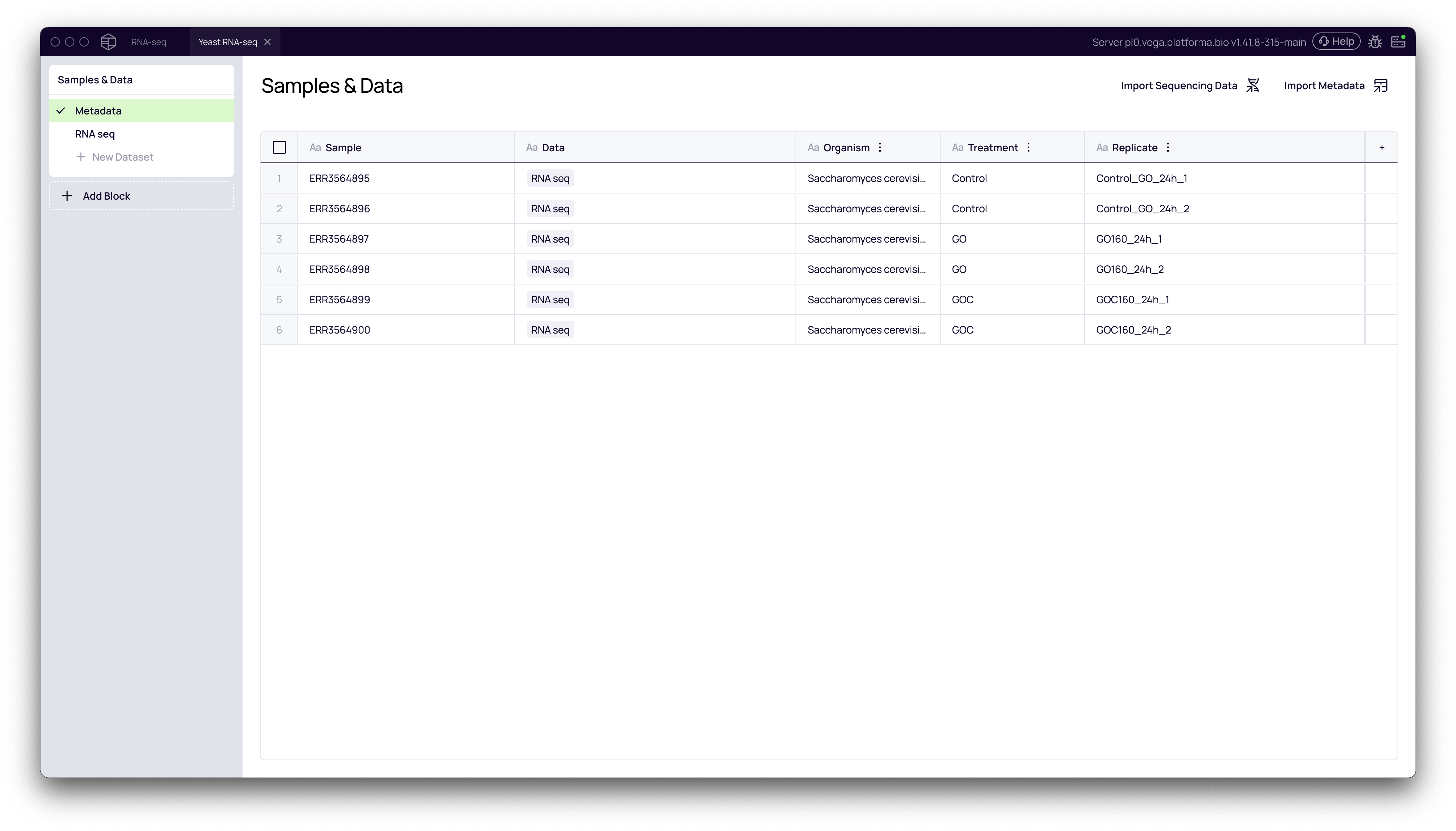
Before beginning the analysis, ensure you have imported your raw RNA-seq data (e.g., FASTQ files) and uploaded a corresponding metadata file. The metadata file is essential as it defines your experimental groups. At a minimum, it should contain a column that distinguishes your samples, such as Treatment with values like Control and Treated.
For this guide, we'll use a project with six samples: two Control, two GO and two GOC replicates.
The Analysis Workflow
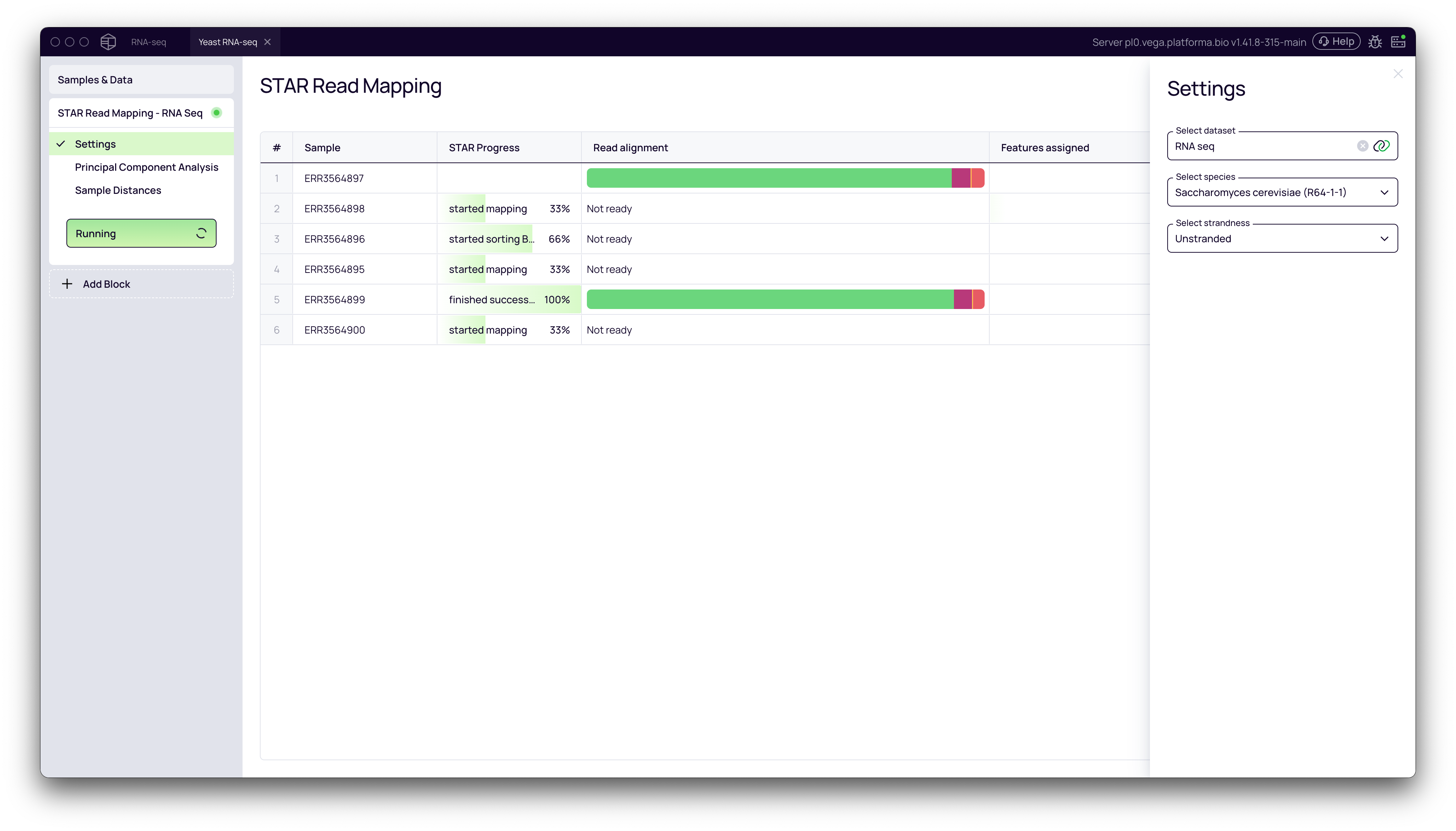
Step 1: Aligning Reads with STAR Read Mapping
The first step in any RNA-Seq analysis is to align the sequencing reads to a reference genome. This process determines the genomic origin of each read, which is necessary for quantifying gene expression.
- From your project pipeline, click the + Add Block button.
- Use the search bar to find and select the STAR Read Mapping block.
- In the Settings panel on the right, configure the analysis:
- Select features dataset: Choose your imported
RNA-seqdataset. - Select species: Pick the appropriate reference genome from the dropdown list (e.g., Saccharomyces cerevisiae (R64-1-1)).
- Select strandedness: Specify if your library preparation was stranded or unstranded.
- Select features dataset: Choose your imported
- Click the Run button to start the alignment.
Step 2: Quality Control and Exploration
After alignment, it's critical to perform quality control (QC) to ensure your samples are of high quality and that the biological replicates cluster as expected.
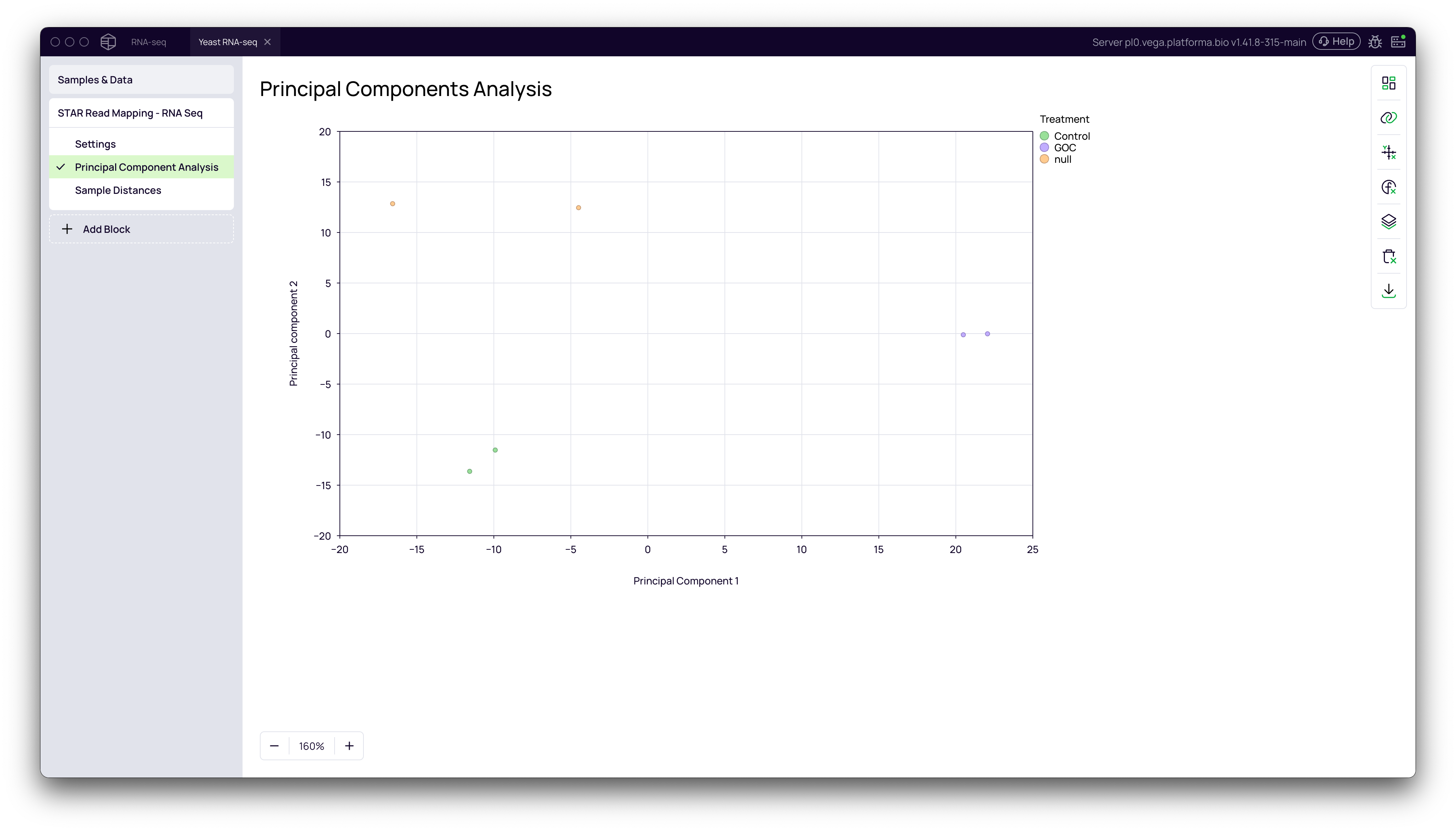
Principal Component Analysis (PCA)
PCA is a powerful technique for visualizing the overall variance in your dataset. Samples with similar gene expression profiles will cluster together in the PCA plot.
- In the STAR Read Mapping block, navigate to the Principal Components Analysis tab.
- Open the Data Mapping panel by clicking the chart icon on the right.
- Drag your metadata column (e.g.,
Treatment) to the Grouping / Color field.
You should see a clear separation between your experimental groups (e.g., Control, Go and GOC), confirming that the primary source of variation in your data is the experimental condition.
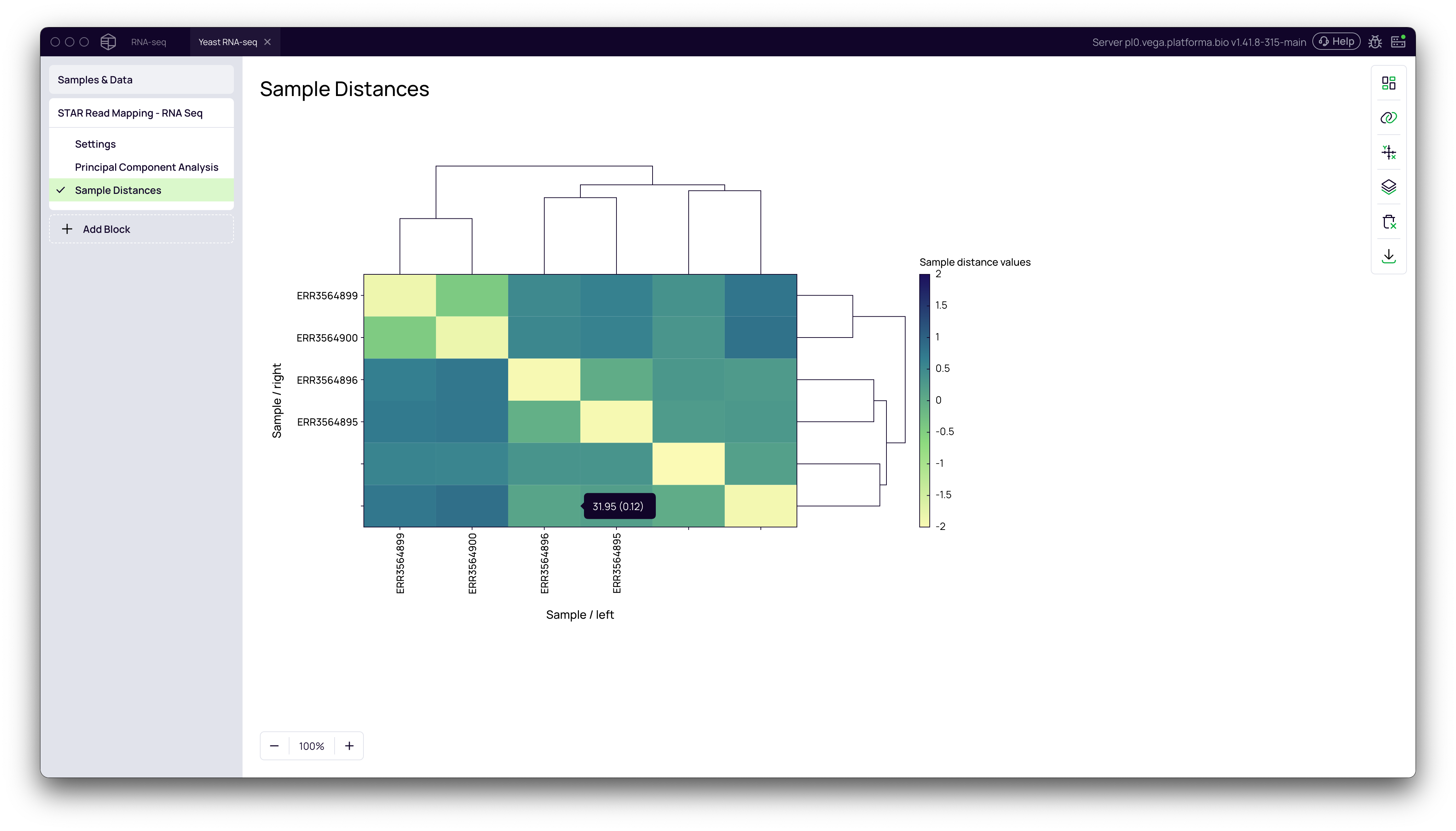
Sample Distances Heatmap
This visualization shows the similarity between all pairs of samples. The hierarchical clustering should group your biological replicates together.
- Navigate to the Sample Distances tab.
- Observe the clustering dendrogram and heatmap. Replicates from the same group should cluster closely.
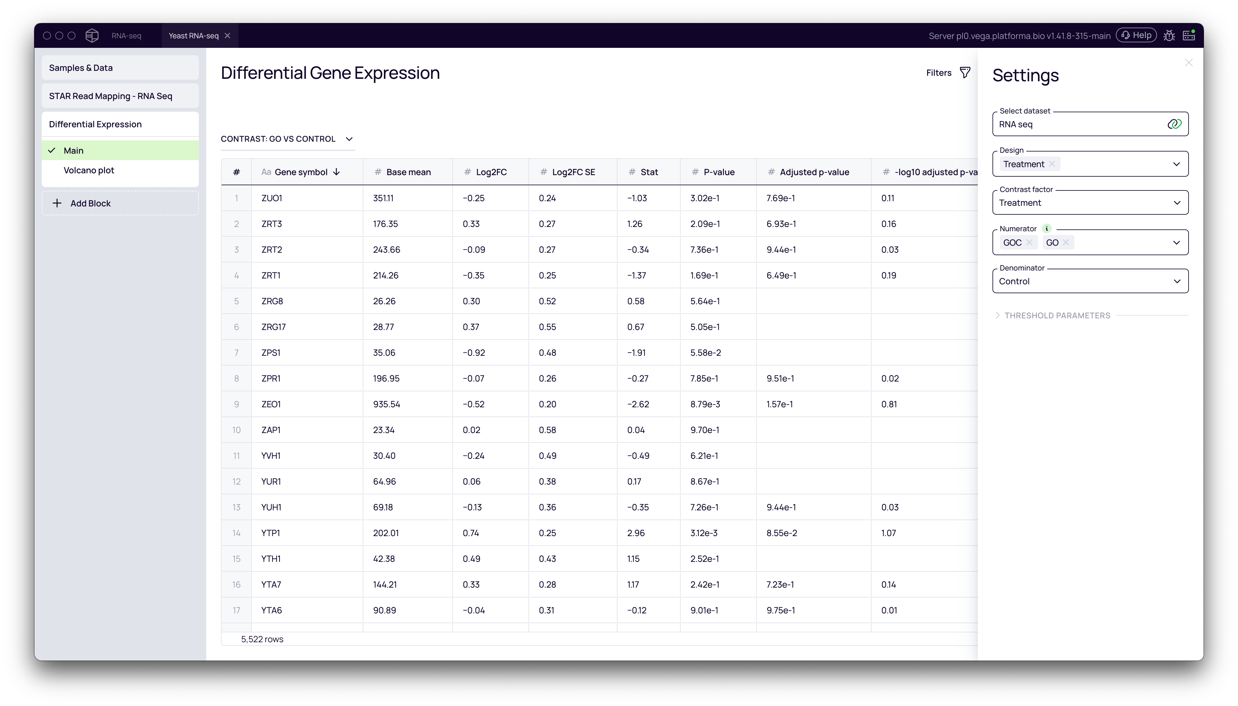
Step 3: Performing Differential Expression Analysis
Now we can identify the genes that are differentially expressed between our groups. Platforma uses the widely accepted DESeq2 algorithm for this analysis.
- Click + Add Block and add the Differential Expression block to your pipeline.
- In the Settings panel, configure the comparison:
- Select raw gene expression: This will be automatically linked from the STAR block.
- Design: Select the metadata column(s) that defines your experimental design (e.g.,
Treatment). These are the factors that you predict to have an effect on the gene expression. It can be just your contrast factor or may include other factors. - Contrast factor: The column that contains groups that you want to compare.
- Numerator: Select the group(s) you want to test (e.g.,
GOCandGO). - Denominator: Select the reference or control group (e.g.,
Control).
- Click Run. The block will generate a table listing all genes with their
log2FoldChange,p-value, andadjusted p-value.
Interpreting and Visualizing DGE Results
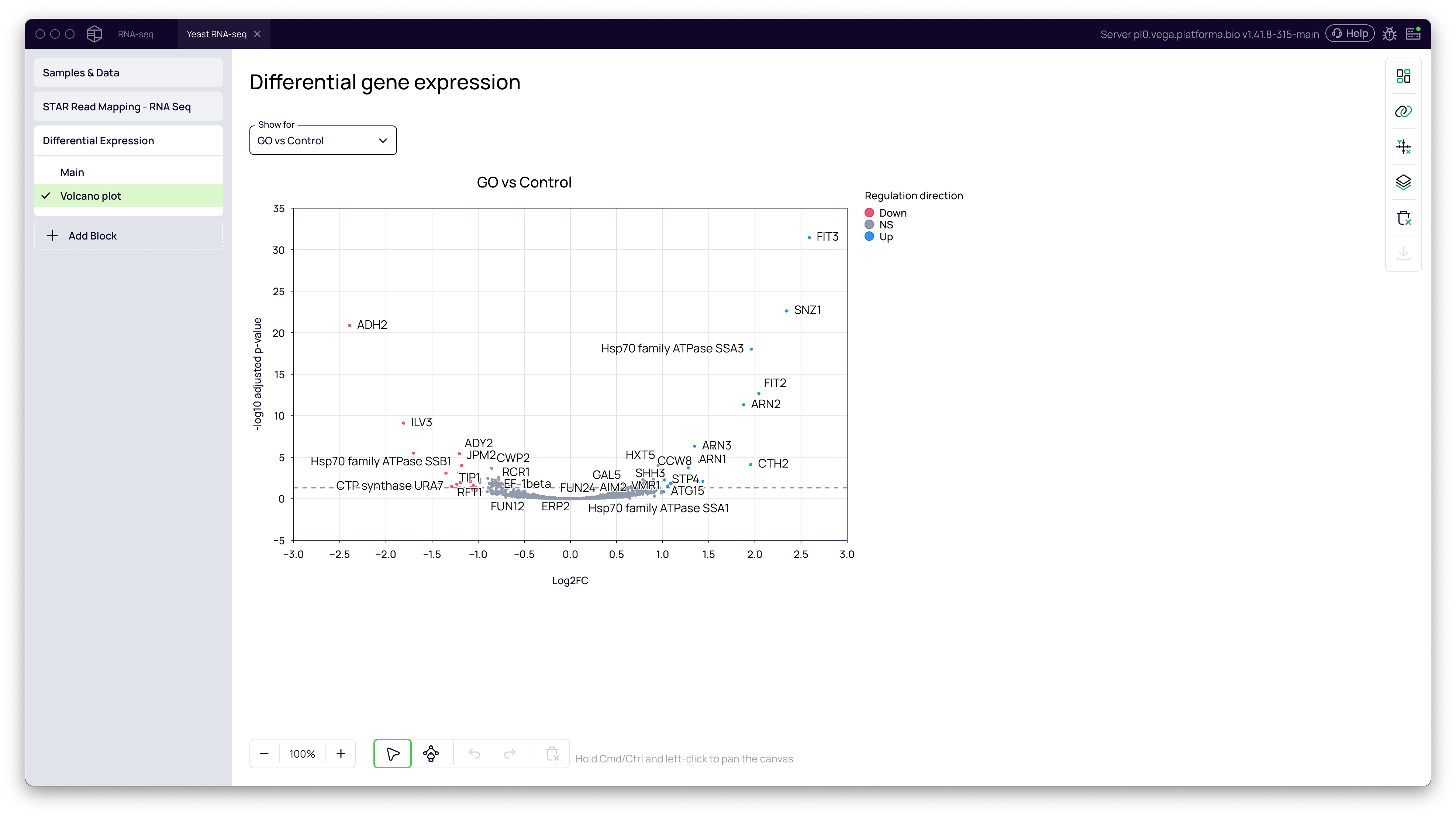
Volcano Plot
A volcano plot is the standard way to visualize DGE results. It plots the statistical significance (-log10 adjusted p-value) against the magnitude of change (log2FoldChange).
- In the Differential Expression block, navigate to the Volcano plot tab.
- The plot is generated automatically. Genes that are significantly upregulated in the
GO/GOCgroup will appear on the top right, while significantly downregulated genes will be on the top left.
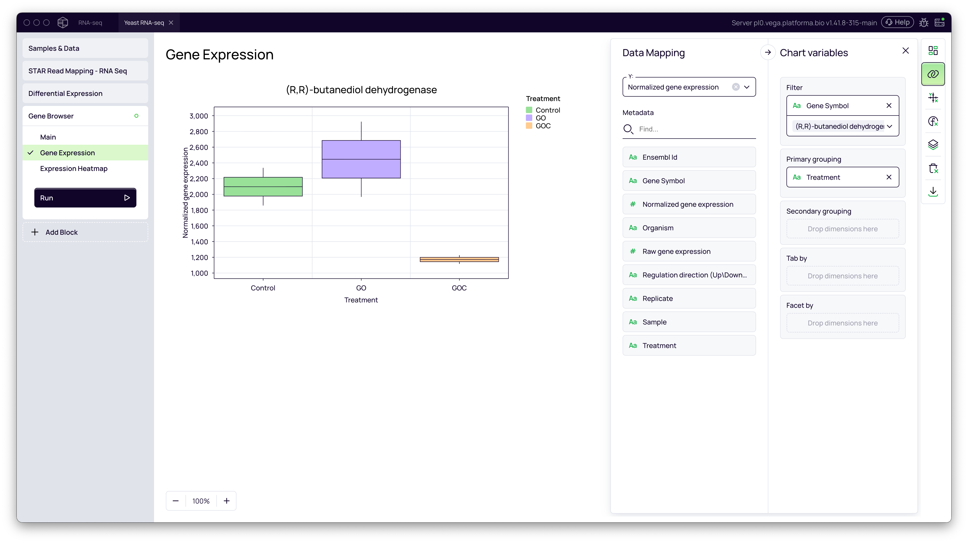
Gene Browser: Exploring Individual Genes
The Gene Browser allows you to dive deeper and visualize the expression of specific genes across your samples.
Box Plots for Genes of Interest
- Click + Add Block and add the Gene Browser block.
- In the Main settings select your dataset (e.g.,
Normalized gene expression) - Go to the Gene Expression tab.
- In the Data Mapping panel, use the Filter to select a gene of interest (e.g.,
(R,R)-butanediol dehydrogenase). - Drag your metadata column (
Treatment) to the Primary grouping field. - This will create a box plot comparing the normalized expression of the selected gene between the
Control,GOandGOCgroups.
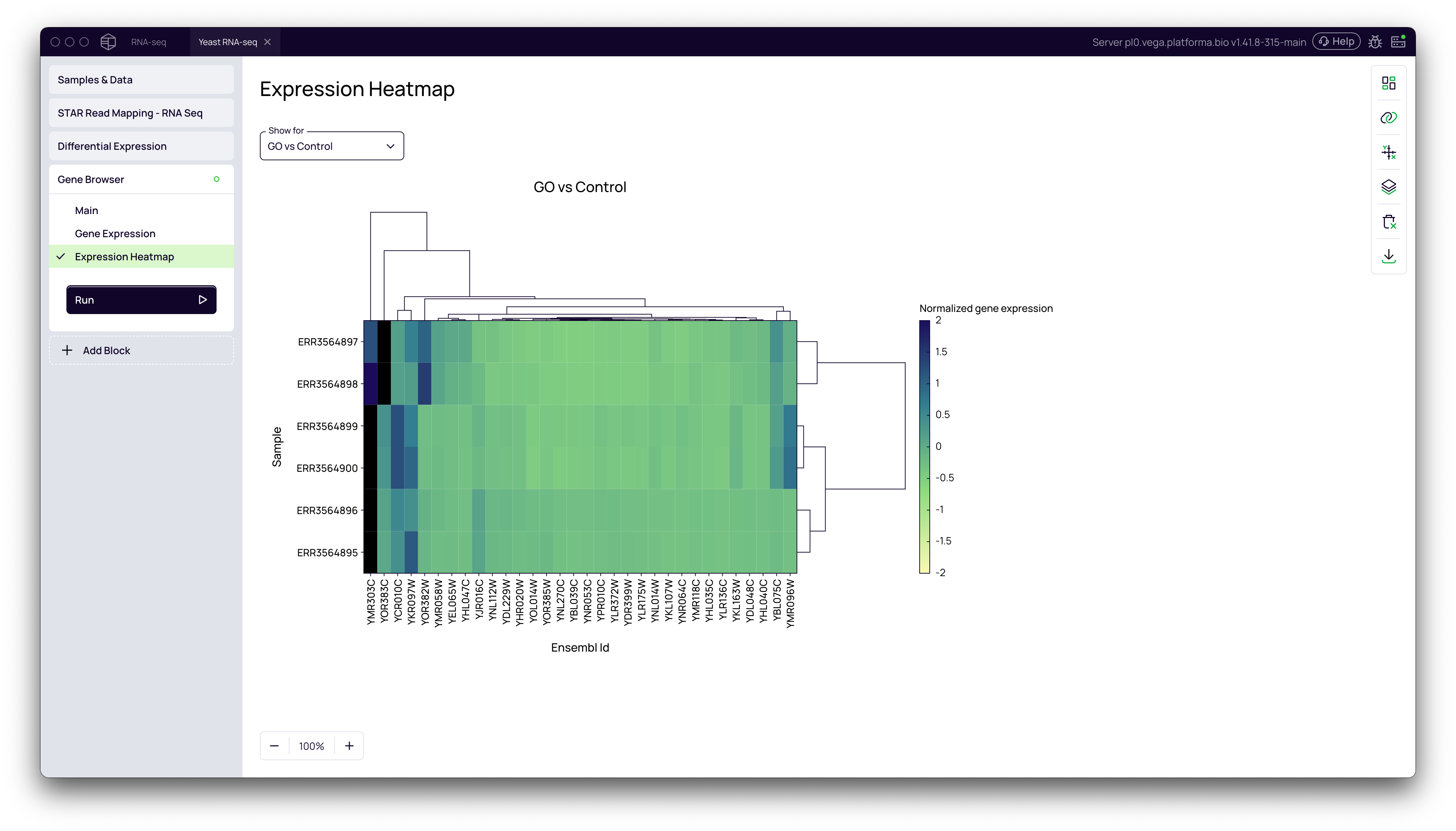
Expression Heatmap
The heatmap visualizes the expression patterns of the top differentially expressed genes across all samples.
- In the Gene Browser block, navigate to the Expression Heatmap tab.
- The heatmap shows normalized gene expression values, with samples and genes clustered based on their expression similarity. This can reveal patterns of co-regulation.
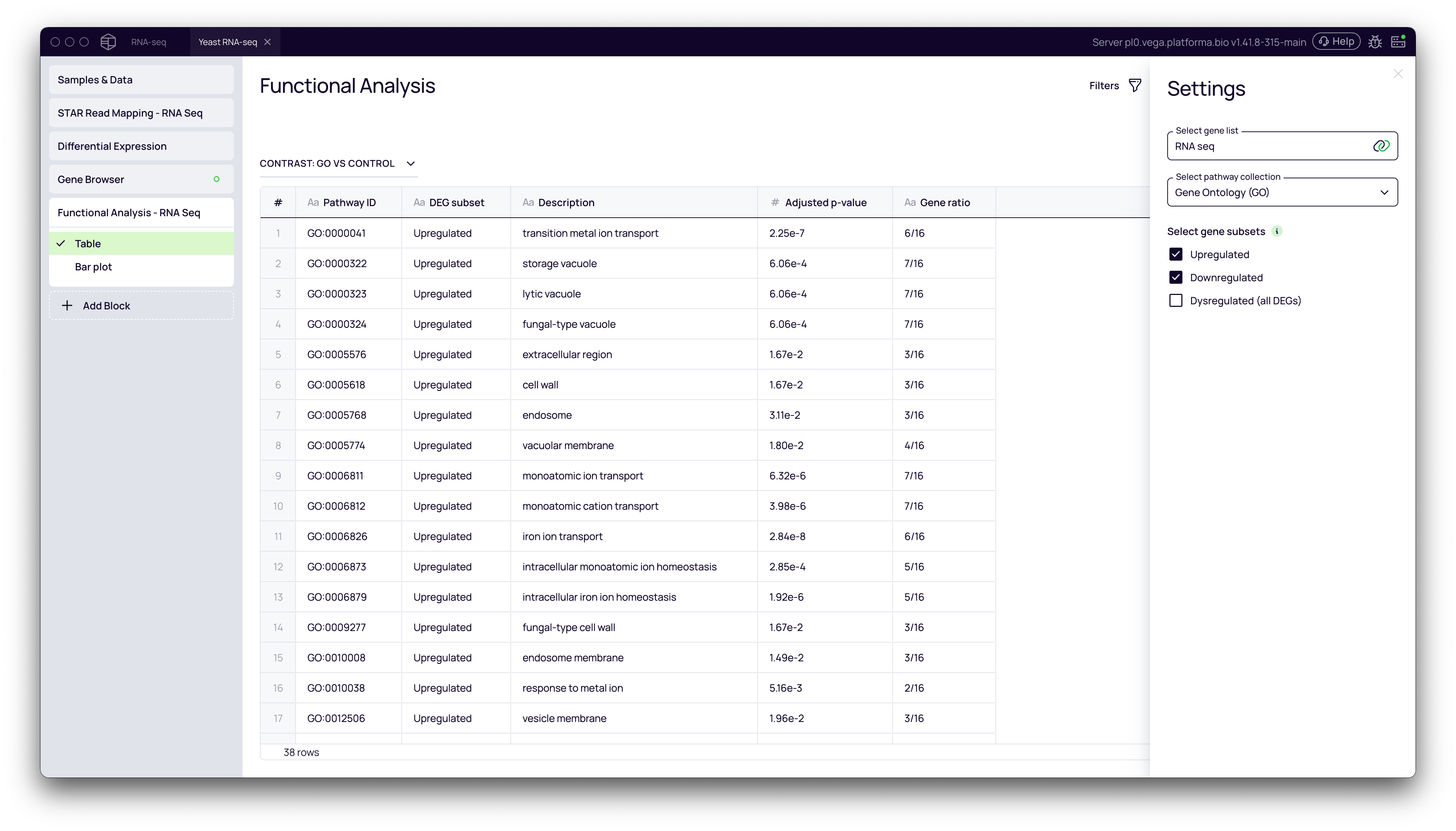
Step 4: Functional Analysis: From Genes to Pathways
The final step is to understand the biological meaning behind your list of differentially expressed genes. Functional enrichment analysis identifies which biological pathways or processes are over-represented in your gene list.
- Click + Add Block and add the Functional Analysis block.
- In the Settings panel:
- Select gene list: This is your dataset.
- Select pathway collection: Choose a database for enrichment analysis. Gene Ontology (GO) is a common and robust choice.
- Select gene subsets: You can run the analysis on
Upregulated,Downregulated, or allDysregulatedgenes. It's often most informative to analyze up- and down-regulated sets separately.
- Click Run.
The block produces a table of biological pathways that are significantly enriched in your gene set.
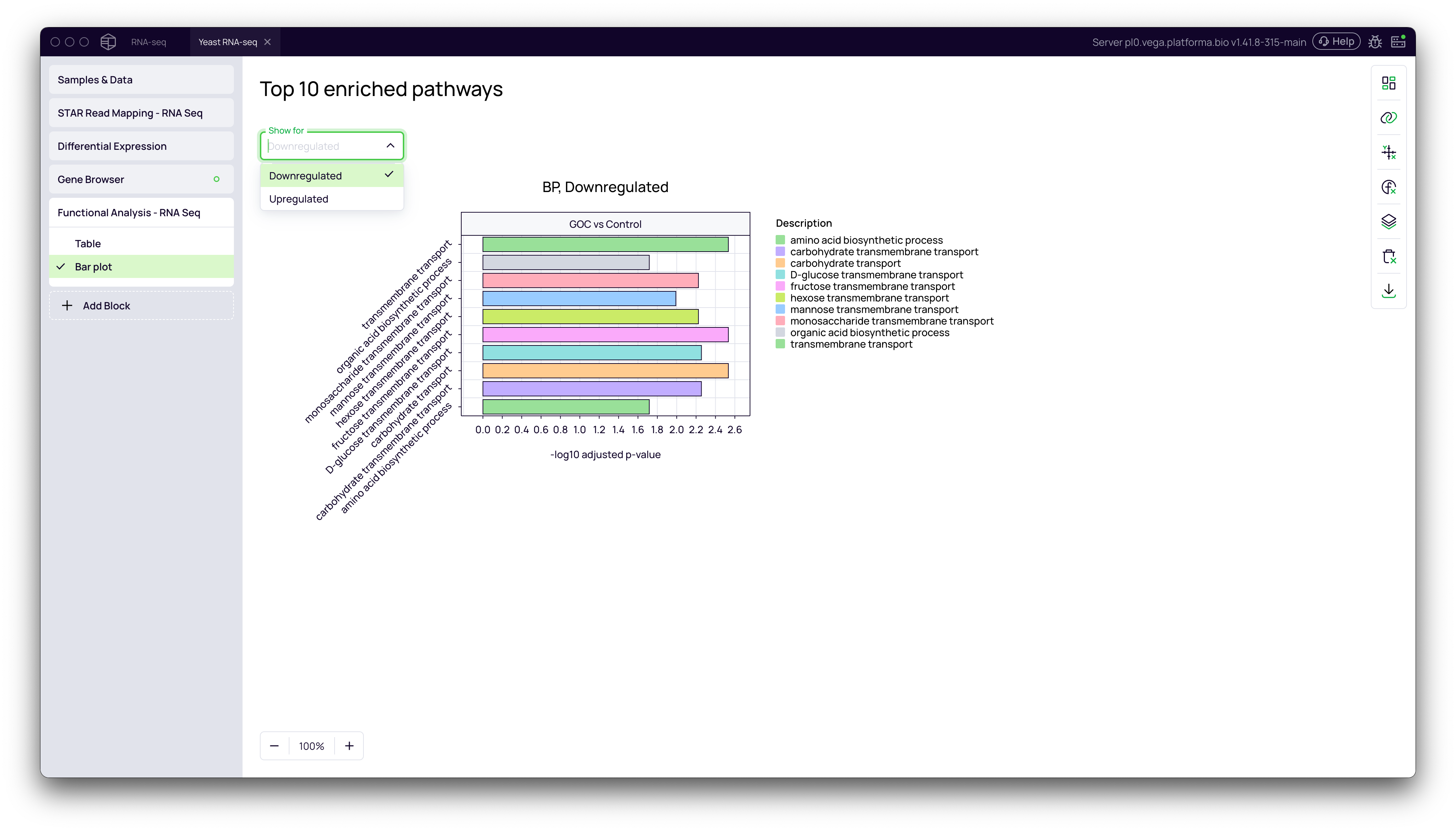
Visualizing Enriched Pathways
- Navigate to the Bar plot tab.
- Use the Show for dropdown to toggle between
UpregulatedandDownregulatedresults. - The bar plot displays the top 10 most significantly enriched pathways, with the bar length representing the statistical significance (
-log10 adjusted p-value). This provides an at-a-glance summary of the key biological processes affected by your experiment.
By following this workflow, you can seamlessly move from raw RNA-Seq reads to a deep, quantitative understanding of the biological changes in your experiment, producing publication-ready tables and figures along the way.