Compositional Analysis: Comparing Cluster Proportions
So far, we have processed our data, visualized it (UMAP/t-SNE), and grouped our cells into clusters (CL-0, CL-1, etc.). We may even have a good idea of their cell types from the marker genes.
The next major biological question is: "How did my experiment affect these cell populations?"
For example, did my Treatment cause an increase in T-cells? Did my Mutant genotype lead to a decrease in B-cells compared to the Wild Type?
Answering this requires compositional analysis. This block counts the cells in each cluster and compares their proportions across your experimental groups, using a powerful statistical method to find "credible" (statistically significant) changes.
Why is this a special analysis?
You can't just use a simple t-test on the percentages of each cluster. Why? Because percentages are compositional data—they all must add up to 100%.
- The Problem: Imagine you have two clusters, A (50%) and B (50%). If your treatment truly causes Cluster A to expand to 75%, it forces Cluster B to shrink to 25%, even if its absolute number of cells didn't change at all. A simple test would incorrectly report that your treatment decreased Cluster B.
- The Solution: This block uses a Bayesian statistical model called scCODA. This model analyzes all cluster proportions at the same time and accounts for this "linked" behavior. It finds the relative changes, giving you a much more accurate and statistically credible result.
Project Setup
This block has two critical prerequisites:
- Completed Clustering: You must have already run the Leiden Clustering block to assign cluster labels to your cells.
- Completed Metadata: You must have imported a Metadata file that defines your experimental groups. For example, a column named
Genotypewith values likeWTandp16-BMR.
Performing the Analysis
Adding the Block
- From your project pipeline (after
Leiden Clustering), click the Add Block button. - Use the search bar to find and select the Compositional Analysis block.
- Click Add to Project to add it to your analysis pipeline.
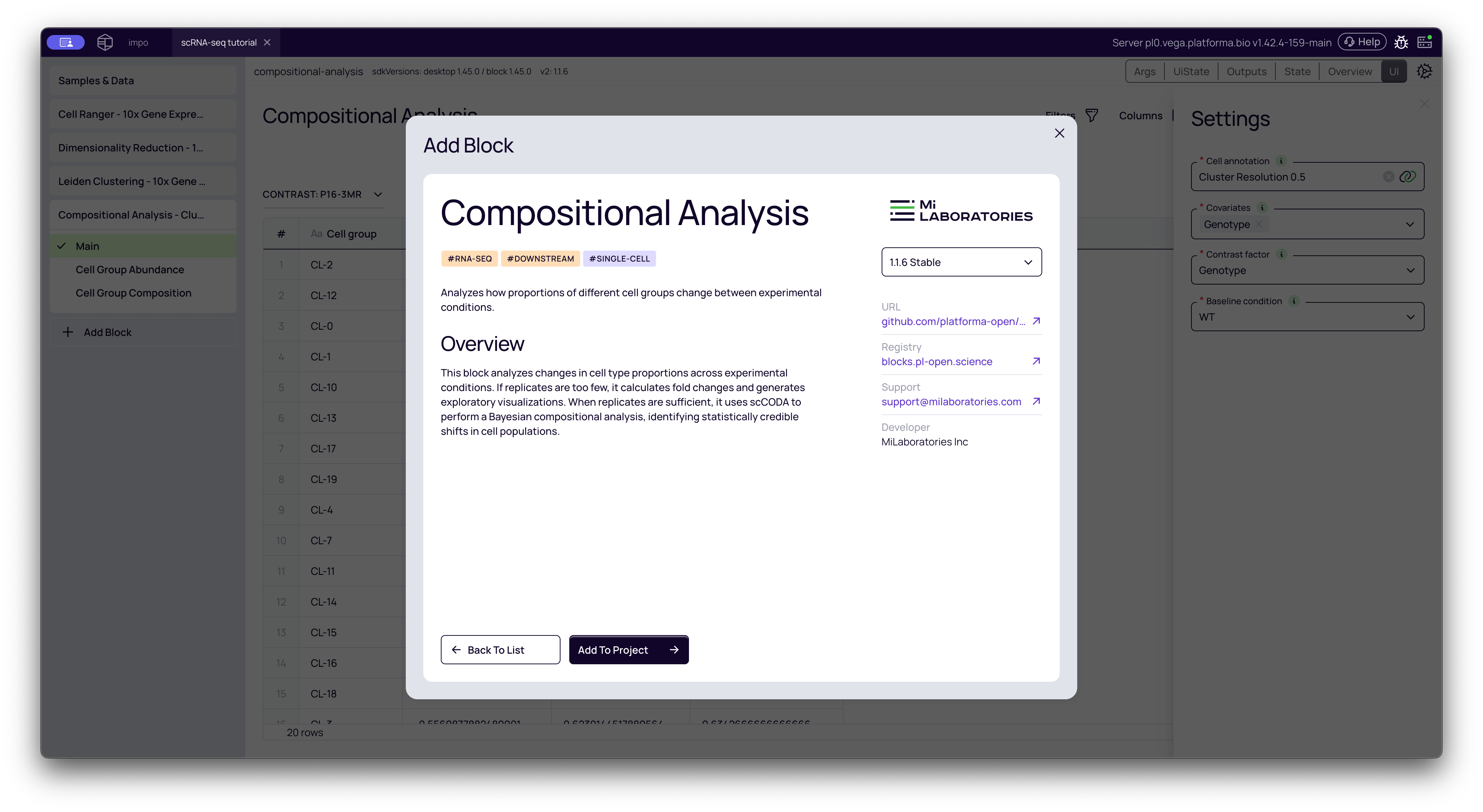
Configuring the Analysis
The settings panel is where you define your experimental comparison. This is the most important step.
-
Cell annotation: This is your input. Select the output from your Leiden Clustering block (e.g., "Cluster Resolution 0.5").
-
Covariates: Select all columns from your metadata that you think might influence the cell composition. This "controls for" other variables. In many cases, you will just select your main experimental variable.
- Example: In the video, we select
Genotype. If you also had aSequencing_Runcolumn (a potential batch effect), you would select that here, too.
- Example: In the video, we select
-
Contrast factor: This is the primary variable you want to test. It must be one of the columns you just selected as a covariate.
- Example: We want to compare genotypes, so we select
Genotype.
- Example: We want to compare genotypes, so we select
-
Baseline condition: This is your "control" or "reference" group. The analysis will calculate all changes relative to this group.
- Example: The
Genotypecolumn has two values,WTandp16-BMR. We set the baseline toWT. This means the final results will show us howp16-BMRchanged compared toWT.
- Example: The
Once configured, click the Run button.
Interpreting the Results
The block generates a Main table and two powerful interactive plots: Cell Group Abundance and Cell Group Composition.
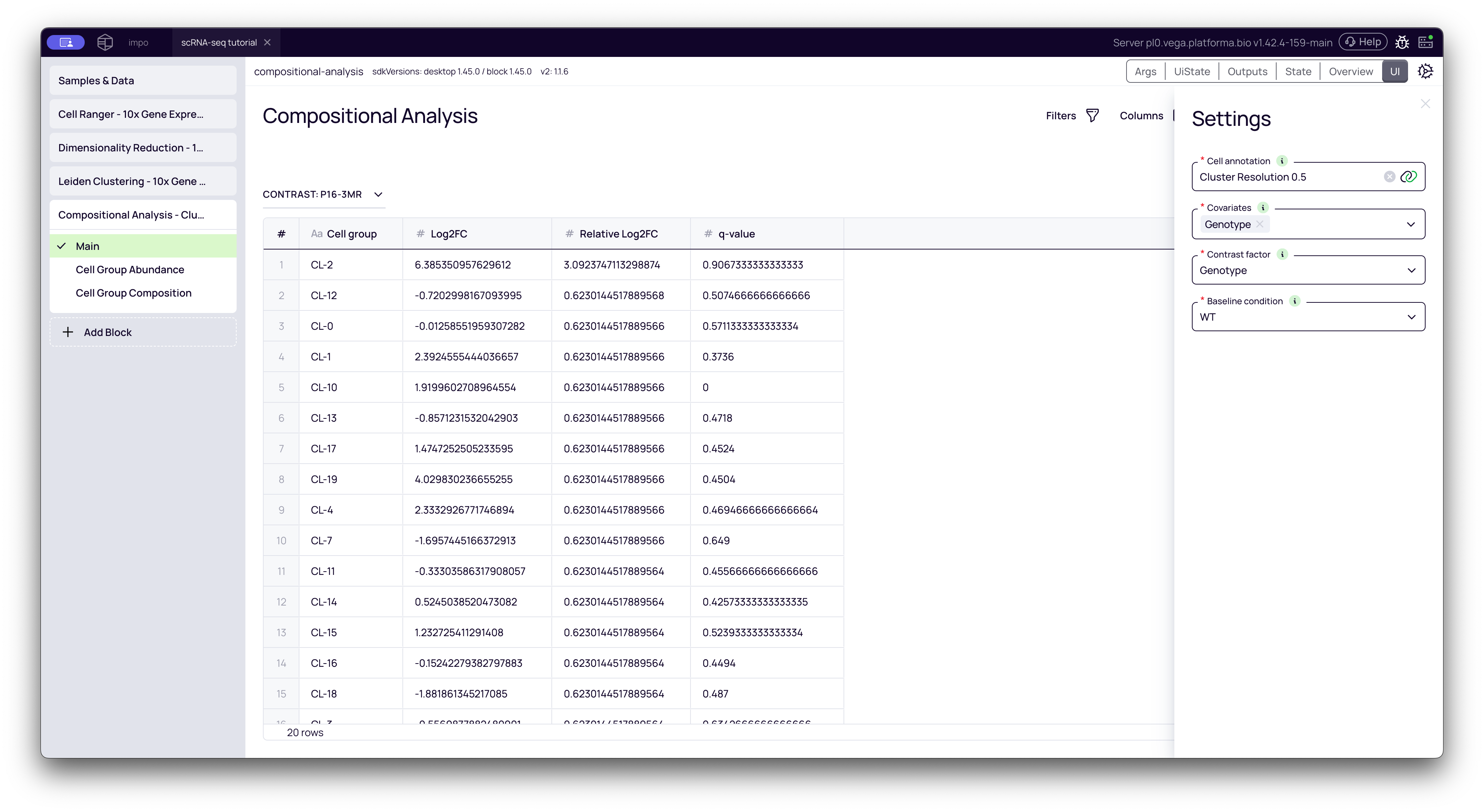
1. The Main Table: Your Statistical Results
This tab shows the statistical output of the analysis. The title (e.g., "CONTRAST: p16-BMR") tells you what is being compared (p16-BMR) relative to your baseline (WT).
Here is what the columns mean:
- Cell group: The cluster ID (e.g.,
CL-0,CL-1, etc.). - Log2FC (Log2 Fold Change): This is the simple, direct change in a cluster's abundance. A value of +1.0 means the cluster's percentage doubled. A value of -1.0 means it was cut in half.
- Caution: This value can be misleading, as it doesn't account for the "compositional data" problem explained earlier.
- Relative Log2FC: This is the statistically corrected value from the scCODA model. This is the most important value. It shows the credible change in a cluster's proportion after accounting for the changes in all other clusters. This is the value you should trust and report.
- q-value: This is the statistical confidence in the
Relative Log2FCvalue. It represents the model's confidence that the change is a real biological effect and not just random noise.- Rule of thumb: A
q-valueless than 0.05 is typically considered statistically significant.
- Rule of thumb: A
How to use it: Sort the table by Relative Log2FC (or q-value) to find the clusters that most significantly increased (positive values) or decreased (negative values) in your contrast group.
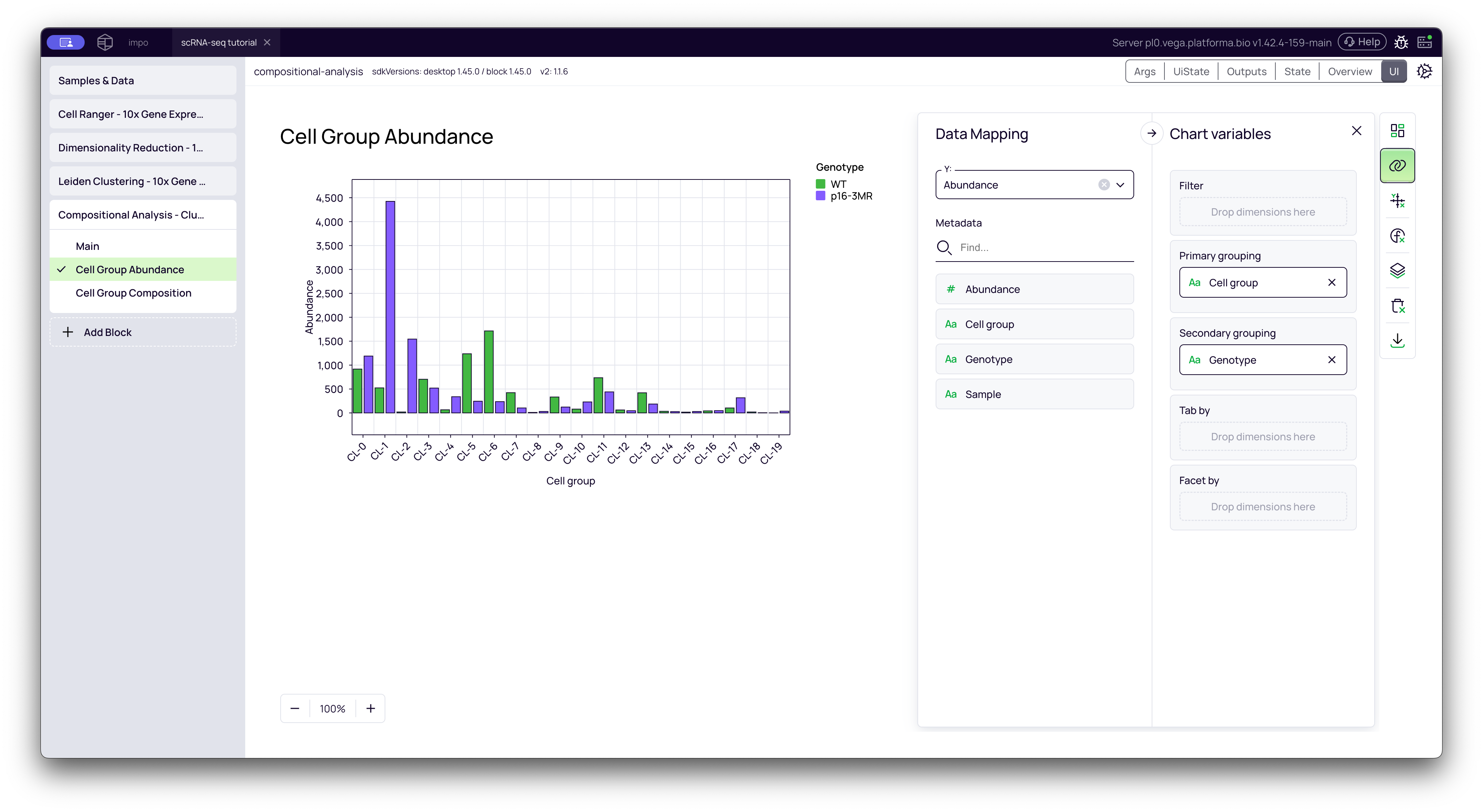
2. Cell Group Abundance Plot
This tab opens the Graph Maker tool with a bar chart showing the absolute abundance (raw cell counts) for each cluster, grouped by your contrast factor.
This plot helps you visually confirm the results. In the video, we customize this plot to make it easier to read:
- Drag
Cell groupto Primary grouping (X-axis). - Drag
Genotype(your contrast factor) to Secondary grouping. - This creates a side-by-side bar chart for each cluster, allowing you to directly compare the cell counts for
WTvs.p16-BMR.
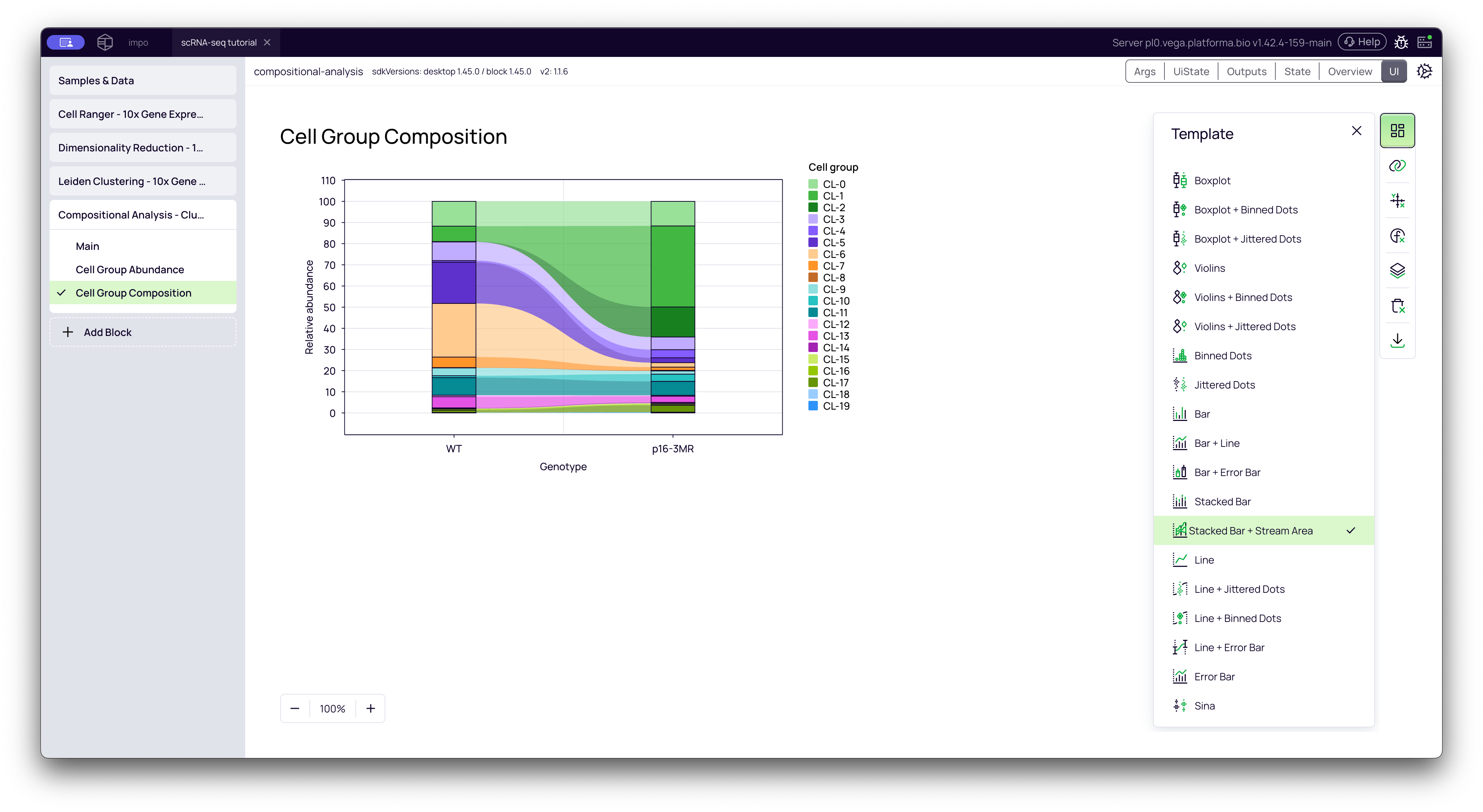
3. Cell Group Composition Plot
This tab shows the relative proportions of all clusters as a 100% stacked bar chart, with one bar for each of your conditions. This gives you a fantastic "at a glance" overview of your entire experiment.
You can hover over any colored segment to see exactly what percentage of the total population that cluster makes up in that condition.
Pro-tip (from the video):
- In the Template settings (top-right, grid icon), you can change the plot type to Stacked Bar + Stream Area to get a "stream plot" or "river plot" visualization, which many people find more intuitive.
- In the Layers settings (3rd from the bottom), you can change the Color Palette to one with more distinct colors (like "Tradic") to make the clusters easier to tell apart.
By combining the statistical power of the Main table with the plots, you can confidently identify which cell populations were altered by your experiment.