Leiden Clustering
In the previous step, we used Dimensionality Reduction to visualize our cells on a 2D map (UMAP and t-SNE). We could see "islands" of cells that looked similar.
The next logical step is to use an algorithm to formally assign each cell to a group. This process is called clustering.
The Leiden Clustering block uses the popular Leiden algorithm to look at the UMAP/t-SNE data and partition the cells into distinct clusters. The goal is to assign a cluster label (e.g., "Cluster 0", "Cluster 1") to every single cell, grouping them with other cells that have the most similar gene expression profiles.
This step is the foundation for all downstream analysis, as it allows you to ask, "What genes are unique to Cluster 1?" or "What cell type is Cluster 2?"
This tutorial assumes you have already successfully run the Dimensionality Reduction block. The Leiden Clustering block uses the 2D coordinates and principal components (PCs) from that block as its input.
Performing the Clustering
Adding the Block
- From your project pipeline, click the Add Block button.
- Use the search bar to find and select the Leiden Clustering analysis block.
- Click Add to Project to add it to your analysis pipeline.
Configuring the Analysis
Once the block is added, you need to configure its settings in the right-hand panel.
- Select dataset: Click the dropdown and choose the output from your upstream block (e.g., "Dimensionality Reduction - 1").
- Resolution: This is the most important parameter for clustering. We will cover it in the "deep dive" section below. For this tutorial, we will leave it at the default value of 0.5.
Once configured, click the Run button to start the analysis.
A Deep Dive into the Concepts
The "Resolution" Parameter: Your Microscope's Focus Knob
Think of the Resolution parameter as the focus knob on a microscope. It controls the "granularity" of your clusters, or how many "zoomed-in" sub-clusters you want to find.
- Low Resolution (e.g., 0.2): This is a "zoomed-out" view. It will group cells into a few, large, broad clusters. For example, it might group all your T-cells together into one big "T-cell" cluster.
- High Resolution (e.g., 1.0): This is a "zoomed-in" view. It will split that single "T-cell" cluster into its smaller sub-populations, such as "CD4+ T-cells," "CD8+ T-cells," and "Regulatory T-cells."
There is no single "correct" resolution; it depends entirely on your biological question. If you want to know the major cell types, use a low resolution. If you are hunting for a rare sub-population, use a higher resolution.
Our Recommendation: A value between 0.4 and 0.8 (default 0.5) is a great starting point for most datasets. You can always add a second clustering block and try a different resolution to see which one best fits your data.
Interpreting the Results
Once the block finishes running, it will generate the same UMAP and t-SNE plots you saw before. However, the coloring has now changed.
Instead of being colored by Sample, the cells are now colored by their new Cluster ID. The legend shows you which color corresponds to which cluster (e.g., CL:0, CL:1, etc.).
You can now visually inspect your UMAP and t-SNE plots to see how the algorithm has grouped your cells.
UMAP Plot (Colored by Cluster)
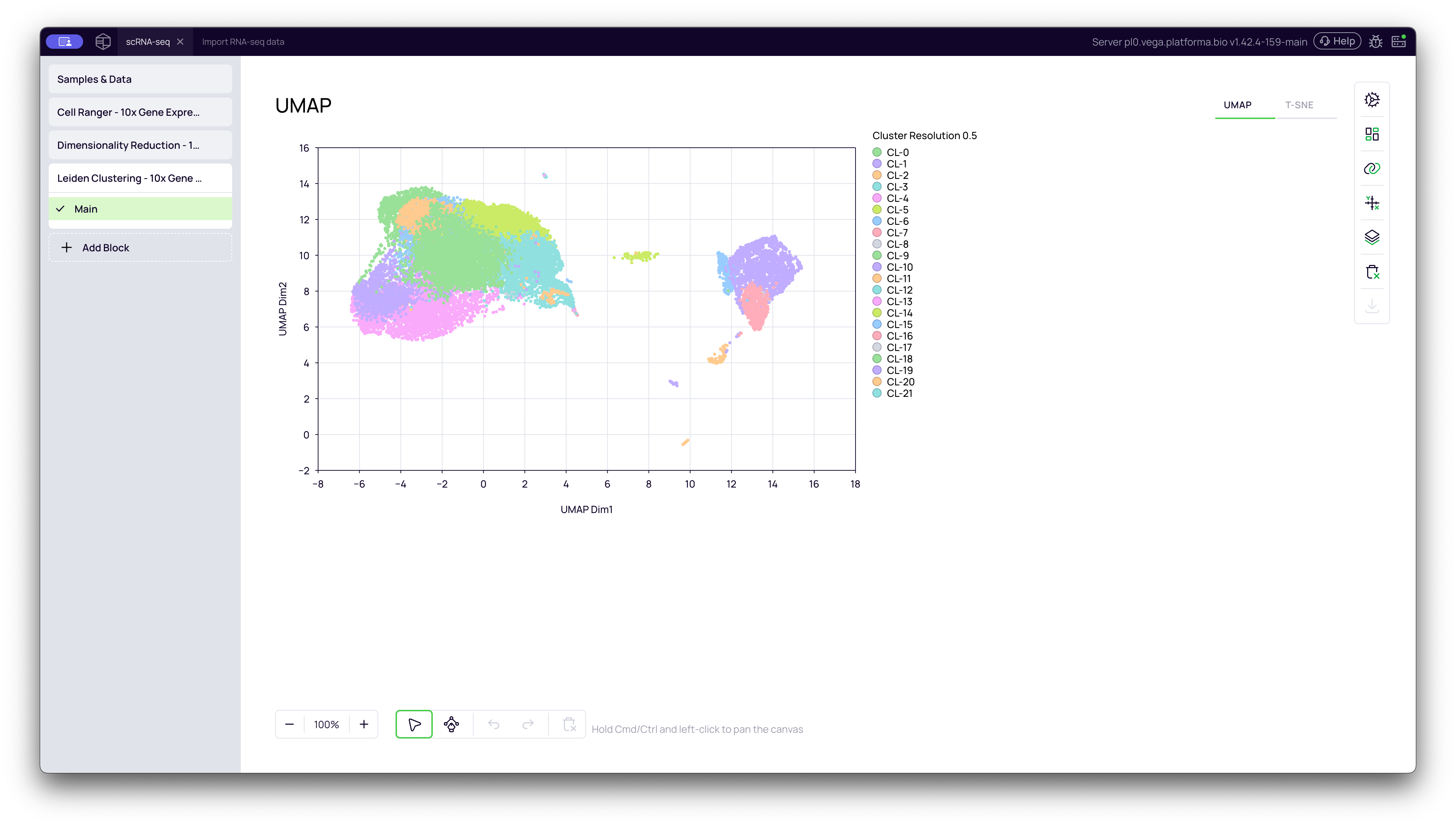
The UMAP plot shows your new clusters. In the video, you can see that the algorithm identified 22 distinct clusters (CL:0 to CL:21) at a resolution of 0.5. Notice how the large "islands" are now clearly defined and sub-divided based on their biological similarity.
t-SNE Plot (Colored by Cluster)
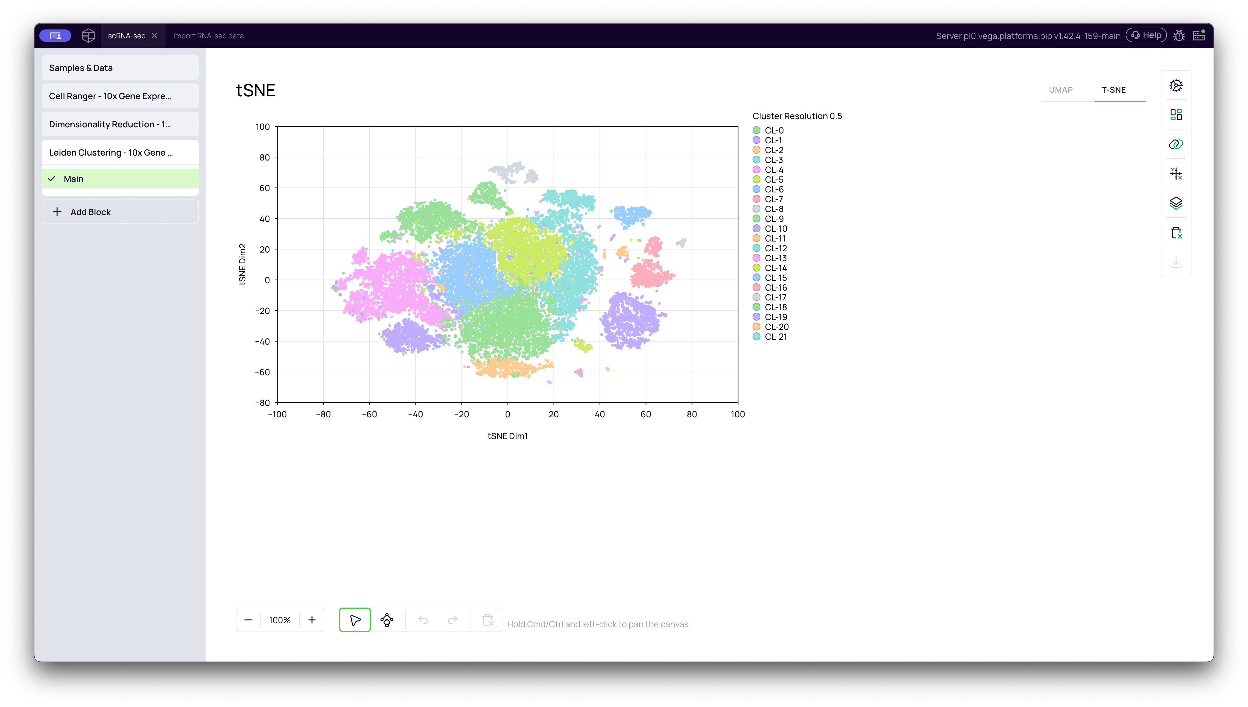
You can switch to the t-SNE tab to see the same cluster IDs visualized on the t-SNE plot.
Why Do UMAP and t-SNE Look Different?
You will notice that the shape and spacing of the clusters are different between the UMAP and t-SNE plots, even though the colors (the cluster assignments) are the same.
This is because they are two different mathematical methods for "flattening" your multidimensional data into a 2D map.
-
t-SNE (t-distributed Stochastic Neighbor Embedding): This method is optimized to show separation. It does a fantastic job of taking clusters and pulling them apart into tight, distinct "islands."
- Limitation: The distance between the islands is meaningless. A cluster that is far away isn't necessarily more different than a cluster that is close. It loses the "global structure" of the data.
-
UMAP (Uniform Manifold Approximation and Projection): This is the more modern method. It is much faster and generally better at preserving the global structure or "connectedness" of the data.
- Advantage: On a UMAP plot, the distances between clusters are more meaningful. If two clusters are close together, it often means they are more biologically related (e.g., a "Monocyte" cluster that is "transitioning" into a "Macrophage" cluster might appear connected).
In summary: Both plots show you the same clusters. t-SNE is great for seeing how separate your clusters are, while UMAP is great for seeing how they relate to each other.
Your data is now clustered and ready for the most important steps: Cell type annotation and Cluster Markers Identification, which will tell you the biological identity (cell type) of each of these new clusters.