Dimensionality reduction and batch correction
After processing your raw data with the Cell Ranger block, you have a massive dataset. For each of your thousands of cells, you have a measurement for over 20,000 genes. This is called "high-dimensional data," and it's impossible for a human to visualize or find patterns in 20000 dimensions.
The goal of dimensionality reduction is to "flatten" this data into a 2D map, much like a subway map represents a complex city showing you what places are closer to each other without getting into much detail. On this map, cells that are biologically similar (e.g., T-cells, B-cells, monocytes) will be grouped together. This allows you to see the underlying structure and different cell populations in your sample.
This guide will walk you through using the Dimensionality Reduction block to generate the standard UMAP and t-SNE plots, which are the foundation for cell clustering and identification.
Project Setup
This tutorial assumes you have already successfully run the Cell Ranger block on your 10x Genomics data or imported data from count matricies. The Dimensionality Reduction block will use the output from Cell Ranger as its input.
Performing the Dimensionality Reduction
Adding the Block
- From your project pipeline, click the Add Block button.
- Use the search bar to find and select the Dimensionality Reduction analysis block.
- Click Add to Project to add it to your analysis pipeline.
Configuring the Analysis
Once the block is added, you need to configure its settings in the right-hand panel.
- Select dataset: Click the dropdown and choose the output from your upstream block (e.g., "Cell Ranger - 10x Gene Expression"). This tells the block which data to process.
- Batch correction covariates (optional): This is a powerful and important setting. We will cover it in the "deep dive" section below. For this initial run, we will leave it blank.
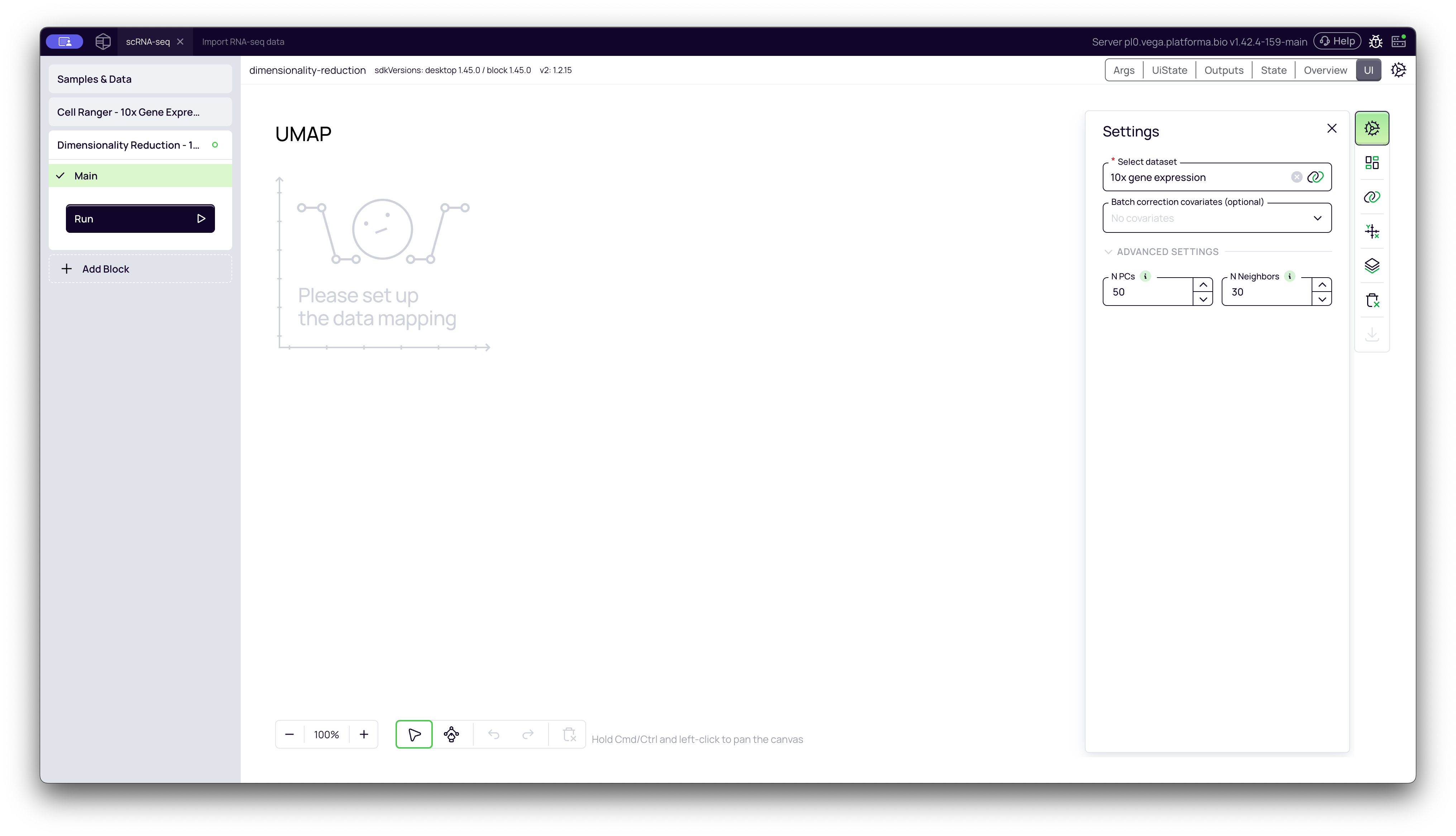
Once configured, click the Run button to start the analysis.
A Deep Dive into the Concepts
What is Dimensionality Reduction (and why do we need it)?
As a biologist, you can think of it this way:
- The Problem: A single cell's "identity" is defined by the ~20000 genes it expresses. To compare two cells, you'd have to compare all 20000 of those values. This is not only computationally difficult, but most of those genes are "noise" (not relevant for cell identity).
- The Solution: This block uses a two-step process:
- PCA (Principal Component Analysis): First, it scans all 20000+ genes and finds the main "sources of variation"—that is, the combinations of genes that best explain the differences between your cells. It discards the noise and keeps only the most important information (e.g., the top 30-50 "Principal Components").
- UMAP / t-SNE: It then takes this simplified data (the 30-50 components) and creates a 2D map. On this map, cells that had similar PCA profiles are placed close together.
The result is a plot where distinct "islands" of cells represent different biological states or cell types.
What is Batch Correction (and when to use it)?
- What it is: "Batch effects" are technical, non-biological variations in your data. The most common batch effect is sequencing samples in different runs or processing them on different days. A simple change in machine calibration or reagent temperature can cause all cells in "Run 1" to look slightly different from all cells in "Run 2," even if they are the same cell type.
- When to use it: You must use this if your samples were processed in different batches and you want to compare them. If you don't, you might see your UMAP split into two big clusters, but the clusters will just be "Run 1" and "Run 2," which is a technical artifact, not a biological discovery.
- How it works:
- First, ensure you have a Metadata file that lists which batch each sample belongs to (e.g., a column named
sequencing_runwith valuesrun_1,run_2, etc.). - In the Batch correction covariates setting, select that metadata column (e.g.,
sequencing_run). - When you run the block, the algorithm will identify and remove the technical variation caused by that batch. This will "merge" the clusters that were only separated because of the batch effect, revealing the true biological differences.
- First, ensure you have a Metadata file that lists which batch each sample belongs to (e.g., a column named
Warning: Never use a biological variable for batch correction. For example, if you select your
GenotypeorTreatmentcolumn, the algorithm will try to "correct" away the very biological differences you are trying to discovery. Only use it for technical variables.
Advanced Settings (Optional)
Under the ADVANCED SETTINGS dropdown, you can fine-tune the analysis. For most datasets, the default values are optimal, but you can adjust them in special cases.
1. Number of Principal Components (PCs)
- What it is: Controls how many principal components (the "important dimensions" from PCA) are used for the final UMAP and t-SNE calculations.
- Effect:
- Higher values (e.g., 50+) capture more biological variance and subtle differences between cells, but increase computation time.
- Lower values (e.g., 20-30) are faster but might miss fine-grained subtypes.
- When to change it:
- Increase (e.g., 50): If you have a very large, complex dataset (e.g., >100,000 cells) with many expected cell types and want to capture maximum detail.
- Decrease (e.g., 20): If you have a small dataset (e.g., <3000 cells) or are just doing a quick preliminary run.
- Recommended Range: 30-50 is optimal for most standard datasets.
2. Number of Neighbors for UMAP
- What it is: This parameter is specific to UMAP. It controls how the algorithm balances "local" versus "global" structure in the 2D map.
- Effect:
- Lower values (e.g., 5-10) focus on local structure. This will create more distinct, "tighter" clusters and is good at separating rare cell populations.
- Higher values (e.g., 30+) focus on global structure. This will create a "smoother" plot that better shows the "connectedness" or developmental trajectories between large clusters.
- When to change it:
- Decrease (e.g., 10): If your main goal is to identify and separate rare cell subtypes.
- Increase (e.g., 30-50): If your main goal is to understand the overall relationship between major cell lineages (e.g., how T-cells, B-cells, and Monocytes relate to each other).
- Recommended Range: 10-30 is optimal for most datasets.
Interpreting the Results
Once the block finishes, it will generate interactive plots. Each dot on the plot represents a single cell, and the colors (by default) represent your different samples.
UMAP Plot
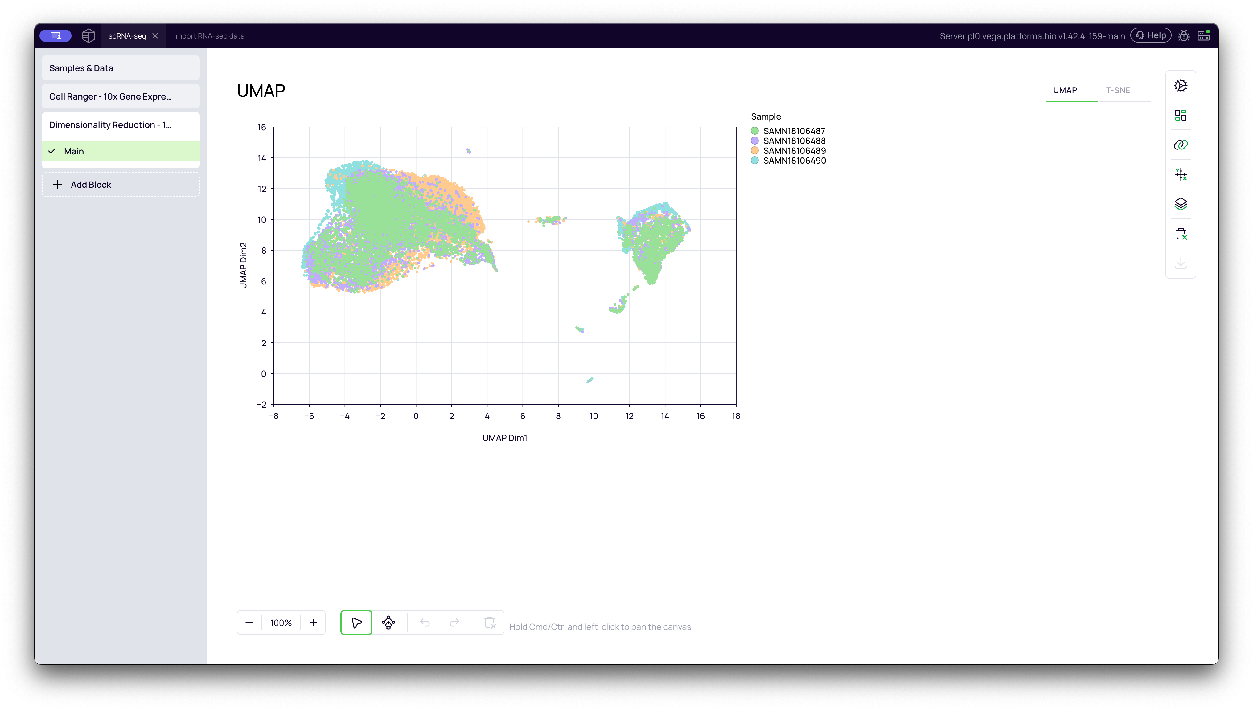
This is the UMAP (Uniform Manifold Approximation and Projection) plot. It is the modern standard for scRNA-seq visualization. It is excellent at grouping similar cells into "islands" while also preserving the "connectedness" (global structure) between related clusters.
t-SNE Plot
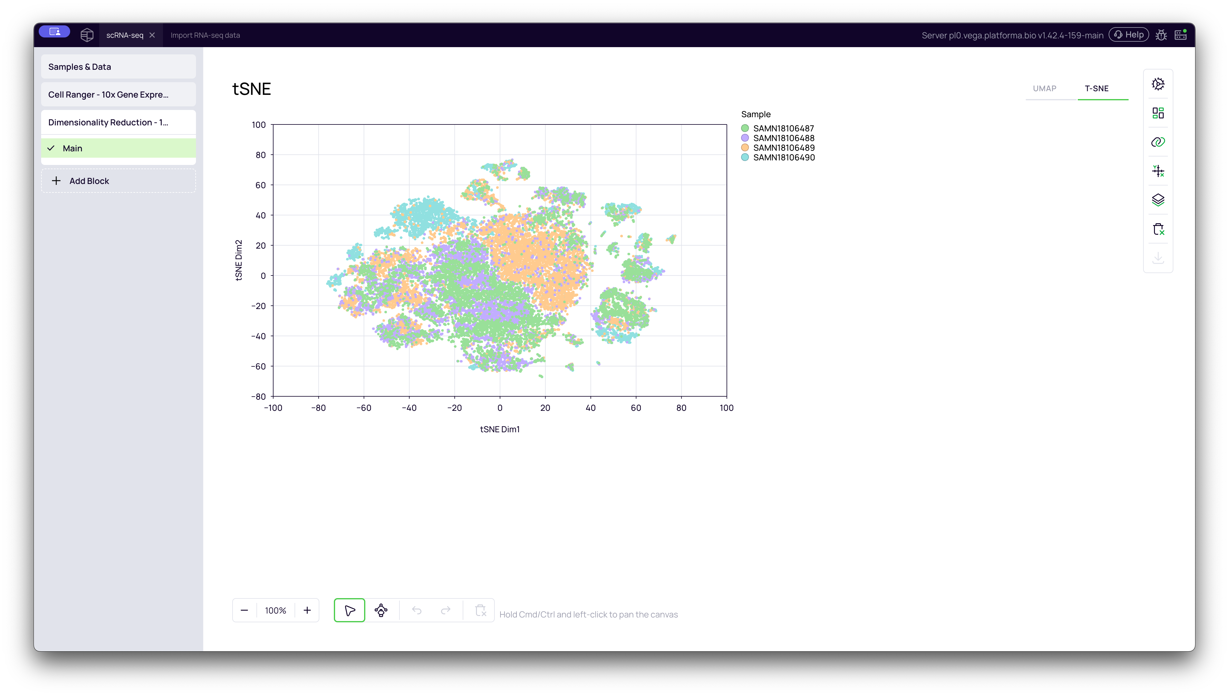
You can switch to the t-SNE (t-distributed Stochastic Neighbor Embedding) plot by clicking the tab in the top-right of the graph. t-SNE is another popular method that is very good at separating clusters, making them look very distinct and "tight."
Important Note: When looking at a t-SNE plot, only the groupings (the clusters) are meaningful. The distance between two separate clusters is not meaningful and does not imply a greater or lesser degree of biological difference.
Batch-Corrected Plots
If you had selected a variable for batch correction (e.g., sequencing_run), the block would have generated two additional plots: UMAP (corrected) and t-SNE (corrected). You would use these corrected plots for your downstream analysis, as they represent the true biological variation without the technical noise.
You are now ready to proceed to the next steps, such as clustering and identifying marker genes for these cell populations.