Gene Usage
The immune repertoire, comprised of a vast array of T-cell and B-cell receptors (TCRs and BCRs), is generated through a process of V(D)J recombination. During this process, different V (Variable), D (Diversity, for heavy chains), and J (Joining) gene segments are randomly selected and joined together, creating a unique receptor sequence. However, this selection is not always purely random; certain gene segments may be preferentially used, a phenomenon known as "gene usage bias."
Analyzing VJ gene usage is critical for understanding the composition and dynamics of the immune repertoire. It reveals which gene segments are favored by the immune system, either at baseline or in response to stimuli like infection, vaccination, or disease. A shift in gene usage patterns can signal a targeted immune response, where clones using specific VJ genes proliferate to fight a pathogen. Therefore, tracking gene usage provides insights into the mechanisms of immunity and can help identify biomarkers for various conditions.
This guide will walk you through calculating and visualizing VJ gene usage with the V/J Gene Usage block.
Project setup
Before beginning the gene usage analysis, ensure you have successfully run the MiXCR Clonotyping block on your sequencing data or the Import V(D)J Data block if you are starting with pre-processed data. The V/J Gene Usage block uses the clonotype tables generated by these upstream blocks as its input.
Performing gene usage analysis
Follow these steps to run the gene usage analysis on your immune repertoire data.
Adding the V/J Gene Usage block
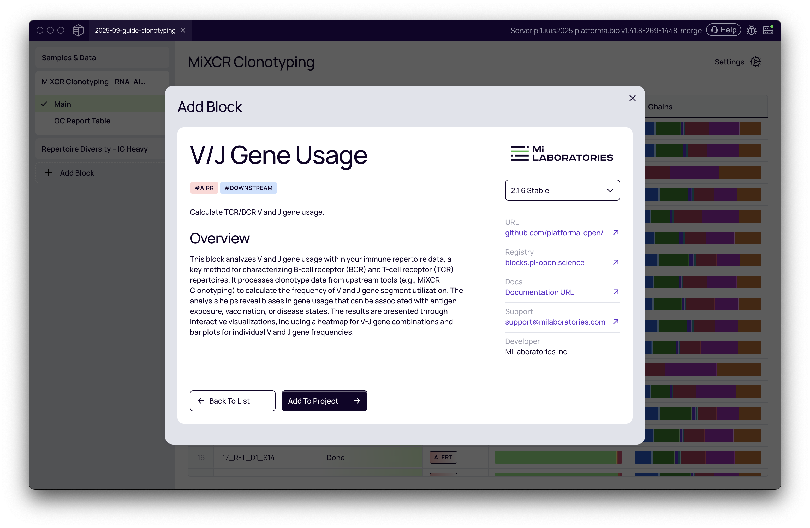
- From your project's analysis pipeline, click the Add Block button.
- A dialog box will appear. Use the search bar to find and select the V/J Gene Usage block under the "Downstream" category.
- Click Add to Project to add it to your analysis pipeline.
Configuring the analysis
Once the block is added, you need to configure the settings for the analysis on the right-hand panel.
- Select dataset: Choose the clonotyping results you wish to analyze from the dropdown menu. For example, you might select IG Heavy.
- Group by: Decide whether to calculate usage based on individual Allele variants or at the broader Gene level. The default and most common setting is Gene.
If you need to analyze multiple chains (e.g., IG Heavy and IG Light), you must add a separate V/J Gene Usage block for each one.
Run the analysis
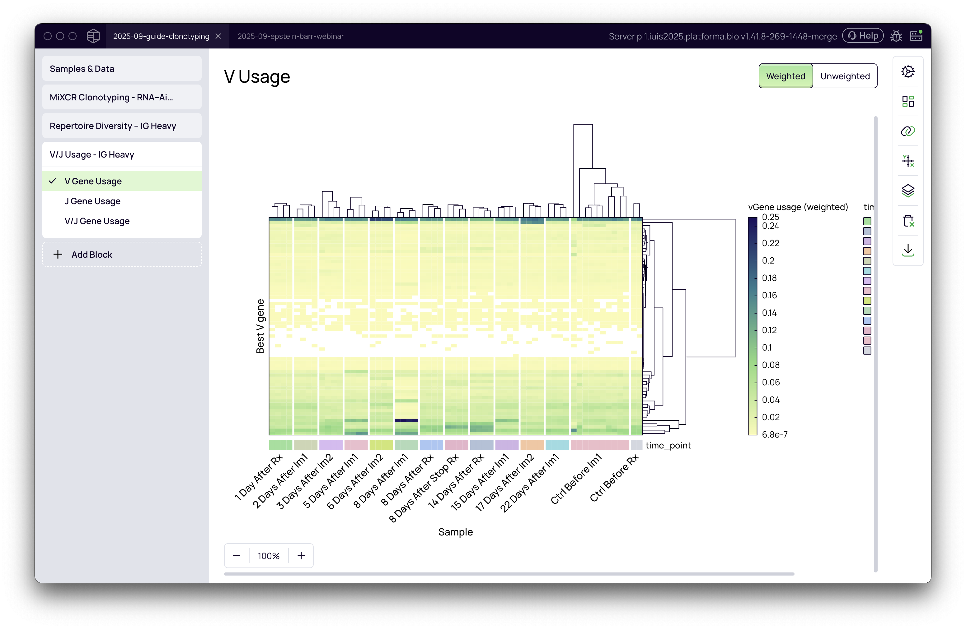
Once the settings are configured, click the Run button. The analysis will execute quickly, producing three interactive heatmap visualizations: V Gene Usage, J Gene Usage, and V/J Gene Usage.
A deep dive into weighted vs. unweighted analysis
The distinction between weighted and unweighted analysis is crucial for interpreting gene usage patterns correctly. You can toggle between these two modes using the buttons at the top right of the visualization.
-
Weighted (by abundance): This is the default view. It calculates gene usage based on the abundance of each clonotype (e.g., UMI counts or read counts). The value in each cell represents the total abundance of all clonotypes that use a specific gene in a given sample. This mode is sensitive to clonal expansions and is excellent for highlighting genes that are part of a dominant immune response.
-
Unweighted (by count): This view calculates usage based on the raw count of unique clonotypes that use a particular gene. Every clonotype is given equal weight, regardless of its size or expansion. This mode reveals the underlying structure of the VJ recombination machinery and is useful for identifying biases in the repertoire that are independent of an active immune response.
Interpreting the results
The results are presented as interactive heatmaps where you can explore gene usage patterns across all your samples.
Understanding the heatmaps
- The Y-axis displays the different gene segments (e.g., V genes, J genes, or VJ pairs).
- The X-axis displays your individual samples.
- The color intensity corresponds to the usage frequency—darker colors indicate higher usage.
- By default, the heatmap includes hierarchical clustering for both genes and samples, which automatically groups similar patterns together, making it easier to spot trends.
Uncovering insights with metadata
The real power of this visualization comes from mapping your experimental metadata onto the chart to provide context.
- Click the Data mapping icon on the right-hand toolbar.
- Drag and drop metadata fields into the "Chart variables" boxes. For example, you can:
- Drag a field like time_point to the Annotations X box to label the samples along the x-axis.
- Drag the same field to the X group box to visually group samples by their respective time points.
In the example from the video, grouping by time point reveals a clear pattern: at the "8 Days After Im1" time point, there is a strong, prevalent signal from a specific V gene, indicating a response to the immunization.
Using the tooltip for details
Hover your mouse over any cell in the heatmap to see detailed information. To enhance this:
- In the Data mapping panel, drag the gene identifier field (e.g., Best V gene) into the Tooltip box.
- Now, when you hover over a cell, the tooltip will show the exact gene name and its usage value, allowing you to precisely identify the genes driving the patterns you observe. For instance, the video shows that the IGHV3-15 gene is significantly expanded 8 days after immunization.
Practical scenarios and recommendations
| Your Goal... | Recommended Mode | Why? |
|---|---|---|
| Identify dominant genes in response to vaccination or infection | Weighted | This mode highlights clonally expanded genes, making it easy to spot the specific V or J segments that characterize the immune response. |
| Compare baseline repertoire structure between patient groups | Unweighted | This mode reveals the underlying VJ usage frequencies, allowing you to see if there are inherent biases in the repertoires of different cohorts, independent of active responses. |
| Investigate V/J pairing preferences | Weighted or Unweighted | Use the V/J Gene Usage heatmap to explore which V and J genes are most frequently paired. The weighted view shows pairs involved in expansions, while the unweighted view shows baseline pairing biases. |
| Assess the diversity of gene usage in a sample | Unweighted | A more even color distribution in unweighted mode suggests that many different genes are being used at similar frequencies, indicating higher diversity in gene choice. |